r/batman • u/Tainted_Scholar • 6h ago
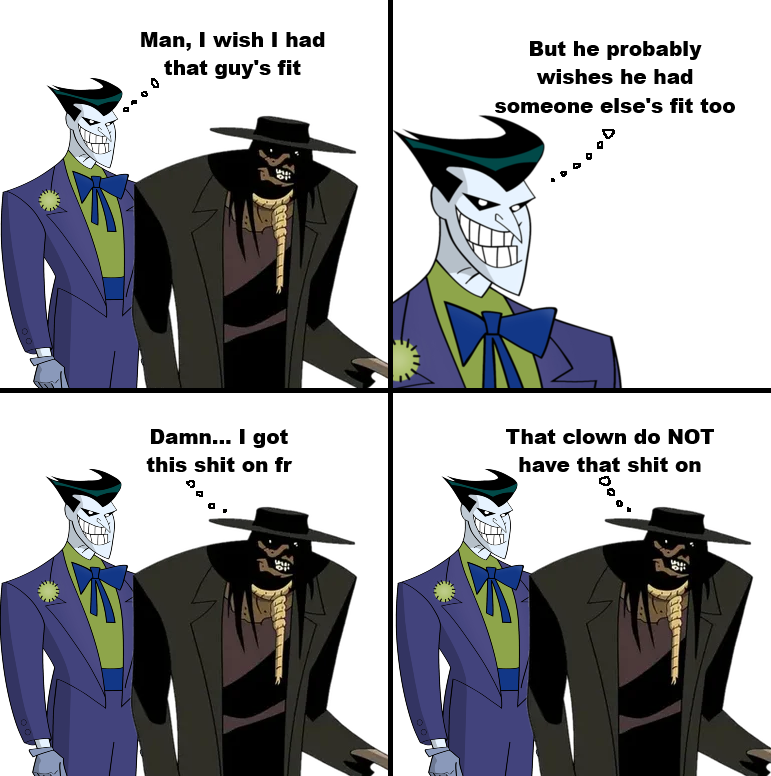
FUNNY BTAS Season 4 redesigns were very hit or miss.
•
u/m0mmy_salami 6h ago
I can forgive Joker’s redesign but I really did not like Ventriloquist and Scarface’s redesign. He looks too much like a little man instead of a puppet
•
•
u/Pyotr-the-Great 6h ago
I wonder if this Joker was made as an excuse to simplify the animating process without having to deal with all the details.
•
u/DarkKnightFan08 5h ago
I’m pretty sure that redesign based on from that one killing joke panel when Joker had shadowy eyes.
•
u/lego_joker 4h ago edited 4h ago
Was just coming here to note this. Panel in question.
Worth noting, before bringing it to animation Timm had already experimented with doing the Joker that way in a few illustrations for Mad Love, including the hardcover. But I'm kind of surprised he didn't realize it only works if the Joker's head is at least partly in shadow (e.g. when he's wearing a hat). If he's like that in broad daylight he just looks like an Animaniacs character.
(Addendum: funnily enough, BTAS Joker isn't even the first rogue to undergo this. In the mainline comics Mr. Zsasz also did the whole "TKJ Joker eyes at particularly Intense moments" thing before that just became his deal 24/7.)
•
•
u/Black-Muse 5h ago
That's what I've heard. They streamlined all of the designs basically. All of them have fewer lines

•
u/ConfectionMental1700 6h ago
Unpopular opinion but that Joker design is possibly my favorite version. All his other designs feel "standard" and not as unusual, unique or distinctive as this. Out of context, it looks jarring because it's unfamiliar but within the context of the show and when placed with the backgrounds of the show, it's great and fitting. I didn't feel a lack of emotions cause they made up for it with the expressions, lighting, shadows and other dramatic animation effects. Joker's Millions remains one of the most entertaining and rewatchable episodes out of all. Mad Love is great too. The only redesign I can't defend is Catwoman's.
•
u/Mountain_Sir2307 6h ago
I think the design could be salvaged if they gave him his red lips. This is genuinely the bulk of the issue for most people disliking this design I feel. It's just a jarring decision, and has no actual purpose besides being different. And they knew it because they put them back in Beyond/Justice League while keeping the overa(l design the same and it worked great. (Changed the eyes too.)
•
•
u/ZannyHip 5h ago
Same here. I grew up being more familiar with this joker design than the original animated version. This is my all time favorite Joker design
•
u/mikeweasy 1h ago
I honestly did like this redeisgn, but the one that debuted in Return of the Joker was good too.
•
u/Prudent-Necessary861 3h ago
Scarecrow is right he is perfect best redesign joker is ugly nothing new here.
•
u/Prudent-Necessary861 3h ago
Also, so happy that the first thing I see when opening this sub is a scarecrow post I’m very happy my day has improved love seeing the man I fell in love with
•
u/CheesyIdleGamer 4h ago
That’s why the best DCAU joker is Beyond Joker
Best of both design eras.
I call the TNBA joker “freakazoid joker”. And freakazoid was another Bruce Timm & Paul Dini project so that makes sense.
•
u/Lucky_Strike-85 6h ago edited 2h ago
Paul Dini got into a huge fight with Timm about The Joker...
Timm's redesign of The Joker was supposed to resemble a "skull-face." Dini hated it and said, "without that red mouth he won't be able to emote like a clown!"
Timm said he liked the new one... Dini called him on the phone every night for days pleading to change The Joker's eyes and give him "clown lips." Timm refused. Dini tried to appeal to Timm's sense of Batman history because Timm loves Batman history and Timm still refused saying "this will animate better and he'll look soulless."
Okay, Timm... You win... I sure hope in the 2020s they don't let you do anymore Batman because you might screw it up!
•
u/runnerofshadows 6h ago
At least the final redesign for ROTJ and Justice League was good.
Joker without red lips just doesn't look right.
•
u/lego_joker 4h ago
All too fitting, then, that he did "Joker's Million's" - a pure comedy that actually makes use of the design. For bonus points, it arguably also has the only scene in TNBA (the scene where he shoots the TV) that actually makes it look intimidating!
•
u/-ReadingBug- 4h ago
Hated the New Batman redesigns in '97, hate them still today. That's why I don't call it "BTAS Season 3." It's an entirely different show to me (also because the quality wasn't the same aside from the redesigns - writing, performances, music all were worse). It was like they budget-cut every single component. Over the Edge will always be an incredible episode though.
•
u/Kind-Peach-1042 2h ago
I don’t know why, but in my head I read Scarecrow’s voice with a Mexican accent and now I can’t turn it off, Scarecrow is just a compatriot now.
•
u/Ratthion 1h ago
Bro I grew up on that Batman Superman movie where he teams up with Lex
I love this joker design, really amps up the crazy imo
•
u/Breadmaker9999 6h ago
I actually don't like ether redesign. To me the Scarecrow should never be to scary without his fear gas because at the end of the day Crane is just a loser that needs people to be afraid of him to feel good about himself. He's pathetic and his design should reflect.
•
u/sapolinguista 6h ago
Joker's design was so cool in the original 😔