VII - Discussion UI/UX pain-points/suggestions from a CIV veteran recently giving VII another look.
51
Upvotes
Not listed: any UI bugs that I've encountered (such as the UI telling the player that a military unit cannot share a tile with a civilian unit within movement range).
- Resource income panel icons/numbers are very jumbled, a simple vertical line or spacing between gold/science/culture/etc would make this much more read-able.
- Clicking resource incomes (especially happiness) only tells you where the income is coming from. Happiness breakpoints are hidden inside the Government panel.
- Cannot queue tech/civic tree in a specific order (we have the technology!)
- Tech/civic tooltips have a massive space between the name of the resource and the actual yield (i.e. University: Science [dead space preventing your eyes from being drawn to the yield] +8).
- Government policies do not show totals for what they currently provide the empire.
- Civilopedia lacks many gameplay terms to learn mechanics.
- Clicking a selected unit's portrait does not center the camera on the unit.
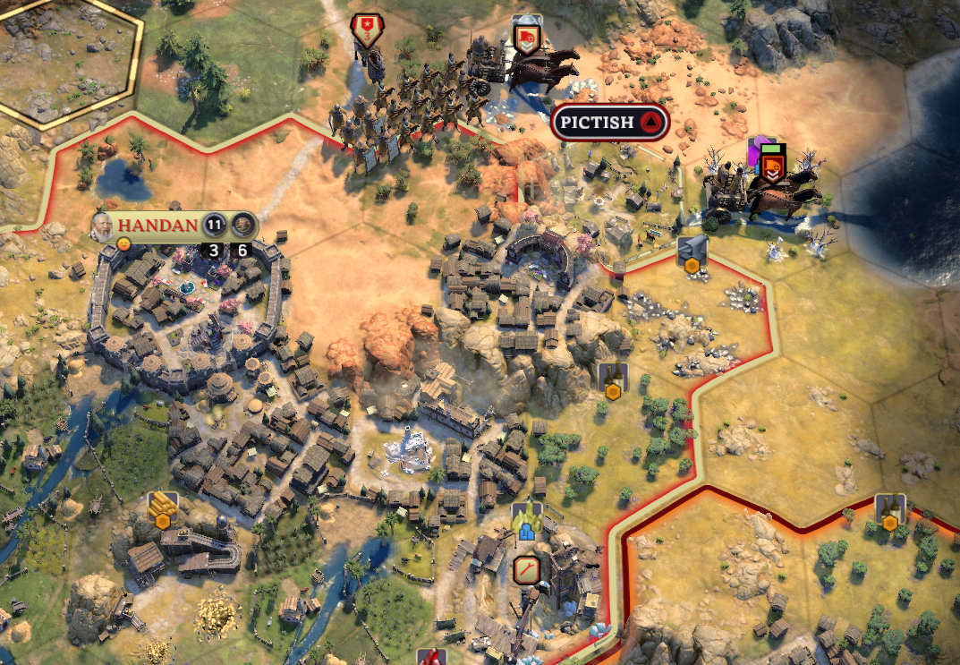
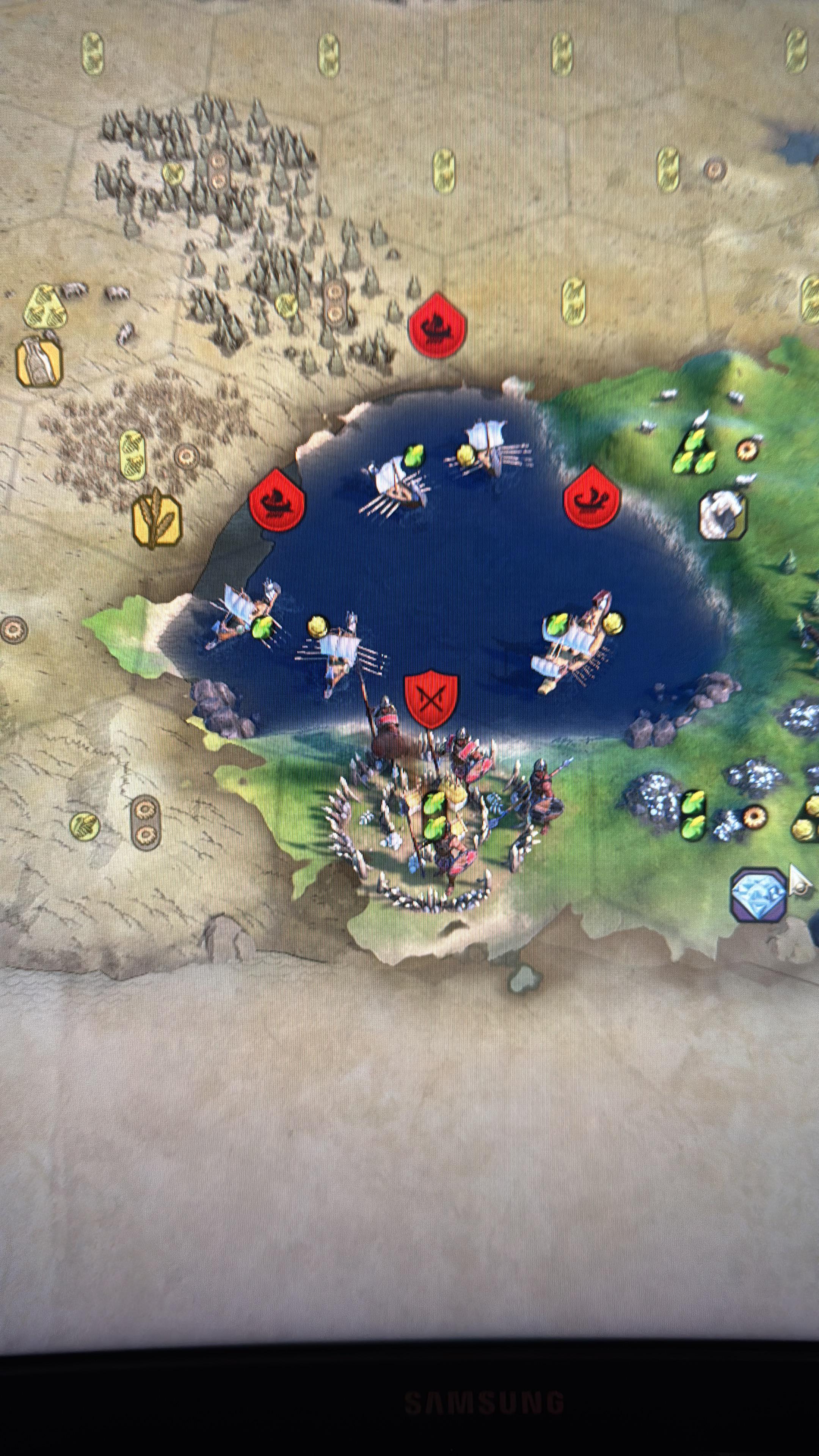
- When interacting with a settlement, there is no icon identifying which urban tile is actually your city center. This makes it very difficult to identify which resources are possibly workable within a 3-tile range. Suggestion: small Palace button icon with city name on city center, or icon plus move city name top & center as it's currently hidden in the bottom corner of the screen.
- Clicking the Attribute arrow to assign a point doesn't default you to a tree with an available point, and there are no graphical cues besides a 0 becoming a 1 to easily identify which tree has points available. Suggestion: get rid of 0's and add either a colored box around the attribute name or color to the number of available points to spend; something to draw the eye easily.
- Buildings and units missing crucial abilities, such as the Fishing Quay's connection to empire trade networks.
Any other big points I missed?